


A version of this post appeared on my blog Yes and Yes in 2012.
Now, I cannot claim to be an expert - I’m a writer, not a designer. But a significant amount you see on my blog (my ebooks, my travel photo layouts) has been my doing. Soooo, if you don’t find those things eye-searingly ugly, you can take the following pieces of advice.
Note, I cannot promise that these tips will make your blog capitol B Beautiful. But they will definitely make it way, way less ‘homemade looking’
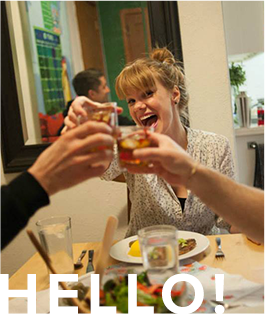
*Accompany each post with an image - preferably an awesome one
Nothing makes a blog post pop like an awesome photo. Where do you find ‘em? Take them yourself or have a dig through Flickr creative commons! Or read Kyla’s awesome post on photo sourcing ethics and shortcuts.
* Resize photos so they’re the same width as your text column
Your awesome image doesn’t look nearly as awesome when it’s tiny and floating above a giant sea of text. Make your image the same width as your text column, forpetessake! You can do this by going into the html or by resizing them in Picmonkey.
* Full-justify your text column
I used to write for a newspaper so I am a diehard fan of full justification. That doesn’t mean supporting every stance you take (though you totally should). That means that the edges of your text column is straight on both sides. If your text column is ‘left justified’ it’ll be ‘ragged’ on the right side.
If you’re using Blogger, the justification icon is the ninth in from the the right on your posting dashboard and looks like a bunch of lines. You want to choose the one that looks like a square box made up of lines.
* Find an an awesome template/theme
There’s no excuse for using ready-made templates when there are approximately a million resources for free, fancy looking templates. Behold! Blogger templates, WordPress templates, Tumblr templates.
* Resize the buttons on your sidebar so they’re all the same size
So you want to promote the blogs you love by adding their buttons to your sidebar. Aren’t you sweet? But, if you’ve got ten different buttons of differing sizes, things can get a bit hodge-podgey. Resize the buttons in Picmonkey and you’re good to go!
* Use social media icons that match the rest of your theme
If you’re rocking a mono-chromatic blog, an orange RSS button or a blue Twitter bird can look a bit out of place. Never fear, there are 8 million different social media icons you can use! Or if you prefer, you can spell out the social media platforms and create your own buttons.
* Resist the urge to over-design
Chevron squiggles and textures and shadowed fonts, oh my! Once you discover the wonderful world of templates and photo editing it can be a slippery slope down to this. Resist the urge, my friends! You are stronger than the gif! Some of the most gorgeous blogs on the internet are also the most simple.
* Remove any of the following
(These are my personal design pet-peeves, so feel free to disregard if you feel I’m a Snotty So-and-so)
* Auto-playing music
* Gifs
* Pop-ups
* White font on a black background
* Anything that scrolls across the screen
* Blog posts with centered text
* Use some of these awesome tools/platforms/websites
Picmonkey - edit photos, add text and stickers, all without signing up for anything or downloading anything
Pugly Pixel - tons of free and cheap downloads
Gimp - like, Photoshop. But free. And not as good.
Color Lovers - color trends and palettes
Now you! Share your favorite design shortcuts and tools!
piggy bank for sale here
I really like Tineye for sourcing images - you specify the colours and ratios, and it searches the Flickr creative commons for you. http://labs.tineye.com/multicolr
Are there really stttiiilll websites that have side-scrolling text and music players? That’s so retro.
I’ll have to try the justified text next time. thx
This is all such awesome advice.
Another thing that I’d suggest is breaking up long paragraphs into a series of shorter ones. It’s much easier on the eye and the page will appear less cluttered. As a bonus, I find that time-poor readers are more likely to read to the end of a post that’s comprised of short paragraphs than one that’s made up of huge slabs of text.
Thank you! I’m realizing I spent more time tweaking and playing with the layout of my blog than actually writing things :/ I’m going to try a couple of these tricks tonight.
I’m a new blogger and greatly appreciate this advice! I think the biggest thing I’m curious about learning is how to create different photo layouts (that also are the same width as the text) within html. Can you recommend any good resources for learning how to do this? I’m at a loss. Thanks again for the great information!
Great advice. I would also suggest paying special attention to typography - it does carry a blog’s content aka the whole point. Here is a good guide to web typography: http://www.dontfeartheinternet.com/css/don%E2%80%99t-fear-web-typography …Also, if you have to decide between legible & boring and illegible & edgy, err on the side of boring.
Great tips. Never thought about resizing my pics so that they are the same size as my text. Going to start implementing that tip right away!
Great post! Could you explain in more detail how to set up full justification layout? I have Blogger and would like to do that, but can’t quite figure out where to change it. Is it in the Template Design? What section do I click on? Thank you!
Hey Melinda! I found the answer to your question over here -> http://blogknowhow.blogspot.de/2009/10/how-to-align-and-justify-blogger-posts.html….It’s pretty easy just a little bit of tweaking with html and you are ready to go…I’d love for you to stop by Love To Go’s little corner of the internet! Happy day, Lisa